I used the fashion trend website http://www.mpdclick.com/mudpie/action/viewHome to find the original blazer template to put onto Adobe Illustrator. I then changed the anchor points on the garment to lengthen the collar, I then used the line tool to add the waterfall section. I then lengthened the sleves my moving the anchor points again. I then changed bottom of the jacket to be rounded rather than pointed, and then using the line toon created the pockets. Then using the swatches on illustrator i found one that matched the jacket in Primarks and all so found a pin striped swatch to replicate the pin striped lining inside the jacket. I found it hard at first to manipulate the points into doing what i wanted them to do but with time and patience I eventually created the end product which i was pleased with as i had never used the programme before.
Erica Stephenson-
I am currently studying Fashion Communication and Promotion at Huddersfield University.
Within my blog i will include my work and assignments for my different modules, as well as my inspirations.
I am currently studying Fashion Communication and Promotion at Huddersfield University.
Within my blog i will include my work and assignments for my different modules, as well as my inspirations.
Saturday
Mid Range - River Island
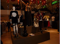
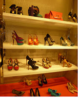 i have chosen River Island as my mid range store as it is one of the many high street stores that sell on trend collections at a reasonable price. River Island in the past has supported graduate fashion week offering prizes to work with them in the industry. This shows that the company is keen for new and upcoming designers that will keep their store full of new ideas. River Island is currently promoting its autumn/winter range through the use of its shop windows. In the window we see a white ice effect in the background to represent the cold season as well as make the clothes and accessories stand out. They are also currently promoting their sale by using red which many customers will know is the sign of a sale as well as the literal ½ price sale to try and draw the customer into the shop.
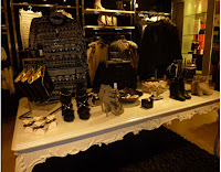 As soon as you walk into the store there is a large display showing outfits that have been put together to try to enhance the sales on those garments. The clothes are displayed spread out which make it easier to walk around to look at the clothes. They use tables to display accessories and clothes and using rugs underneath them creates a sense of luxury, which then will generate more sales as well as improve the customer’s experience. The use of music in the store is also use to create an upbeat atmosphere which will improve store experience.
 Tuesday
Economy Range - Primark
As part of my Fashion Industry module I have to create a shop report on 3 different stores from 3 different market levels. I have to analyse each store on Visual merchandising, Product range presentation, Location of product ranges in relation to the customer flow through the store (Windows, entrance, pause points, pay points & exit). I have decided to look at the well known store Primark for my Economy Range.
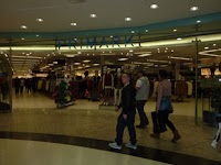
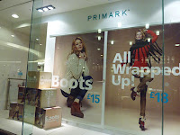
Primark is currently promoting its autumn/winter collection using the slogan ‘All wrapped up’. The shop windows have both dressed mannequins and advertisements to try and attract the customers into the shop. The advertisements are promoting winter accessories and to draw the customers into the store they have included the price on the image to try and generate more sales.Inside the store different garments are grouped together such as jeans are all in the same area of the store making it easier for the customer to find what they are looking for. In store mannequins are also used as pausing points to help promote more of the collection. Primark is the very definition of fast fashion which is shown by having 15 cash desks and using an electronic voice to move the customers along, generating sales is the main priority of Primark rather the customer’s store experience.

Week 4 - Illustrator Garments
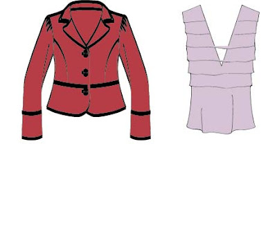
I used the garment specs from my online University module page. I downloaded the images and used Adobe illustrator to change the colour of the garments aswell as the width of lines. I found this first introduction to the programme both interesting and challenging, as i have never used teh programme before i havent yet got my barings on what all the different tools do, but i am looking forward to learning. I am going to use the tutorials online to help me in using the programme and knowing which tools to use for specific areas.
Wednesday
Comp Shopping
Primark, Topshop and Mulberry Bag Display Comparisons
To begin my module research i have started to look at
different ranges of bag displays, from economy range in Primark, to Mid-Range in Topshop, and Designer in Mulberry. From the photos as well as in store you can see differenced with each range. Primark has tried to put as many bags as they can together, and many of their bags are the same just in different colours. You can also see that the quality isnt there as many are not real leather. Topshop as spread out there display a little more than Primark but it is still clutterd and as you can see in the photo it looks a bit like jumble sale which is not teh word i would usually use to describe Topshop. Mulberry as a top end designer brand and well known for its bags, has a great display which has a light background to make the bags stand out more and there is less variety of colours but more variety in the actual designs than seen in Primark. Mulberry use minamilsm and it works very well as it makes the bags look more exclusive and expensive and adds to the luxury of the brand.
Tuesday
Leeds, Autmn Shop Window Diplays
In my first week I was asked to go to either leeds or manchester to look around the shops, and take photos to find something interesting to write about for my fashion writing module. I went to Leeds and found the Victoria Quarter the most exciting as it was indoor and made the stores feel more luxurious with the marbles floors and mosiac ceilings. I found that many of the shop windows were supporting the same theme of using; trees, leaves and woodland creatures to represent their Autmn/Winter lines. I also found the collaboration between Pixie Lott and Lipsy interesting as more and more celebrities are becoming designers through their popularity and style rather than their actual design skills.
Another shop window i was excited to see was the Harvey Nichols display, as they are famous for their innovative window displays. In the current display they use green graphic printed trees on the window to catch the eye of the customer, and then wire for the trees and camoflague nets for the leaves creating a dramatic feel, but also keeping within the theme of Autmn.
Shop window displays are a very important to the retailer as they help self promote the brands clothing. it is a 24 hour advetisment.
Subscribe to:
Posts (Atom)


